Hi everyone! Welcome to Tutorial Tuesday. Sorry I've been away (if you even noticed - LOL!) but I've been uber busy. I'll fill you in sometime :)
For this tutorial I'm simply going to show you one of the functions in photoshop that is useful to know how to use. It's the hue/saturation adjustment. This is great for changing the hue of photos - especially black and white ones (keep reading on) but I use this adjument a lot when working with digital scrapbooking, or even hybrid projects, which I can't wait to show you! For this example, I chose a super cute digital element from Crystal's Digital Template Shoppe. She has designed 2 digital kits, and they are way cute. I created a super fun hanging decoration using her digital elements. I'll share those photos later. Okay, let's get started.
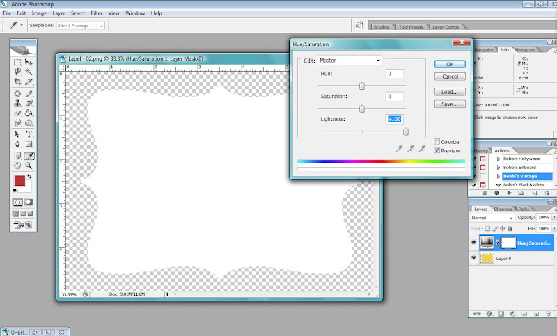
1. Open the image/digital element or object you want to work on. To bring up the hue/saturation adjustment, you can go to Layer>New Adjustment Layer>Hue/Saturation, OR if you don't have time to waste, simply click on the half black/half white circle at the lower right hand side of the screen to bring up a list of adjustment layers you can automatically create. Give it a try. When you create a hue/saturation layer, this little screen will pop up:
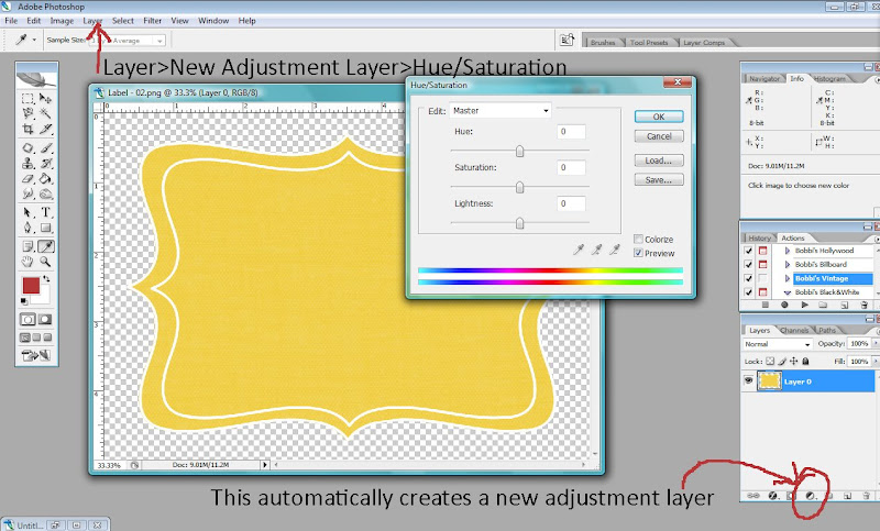 2. We'll start with "Hue". What this does is simply change the color of the object/image. By sliding the slider to the right or left, you can see the fun shades your image will change. This works best on photos IF the photo was black and white to begin with. If I wanted to use a fun digital element on a page but it didn't quite match the colors I was using, I could easily change the element to match by sliding the hue slider until the element changed to the color I wanted. You can also click the little box "Colorize" to change the entire image (even a color photo) to the same hues. Just play a bit and you'll find all kinds of uses for this "hue adjustment!
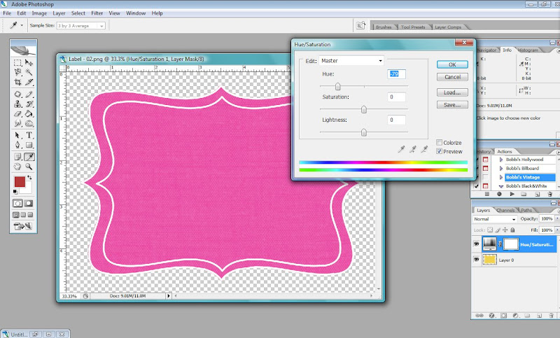 3. The saturation adjustment simply intensifies the color of your image, or removes the color completely, depending on which way you drag the slider. Dragging it to the left (as seen below) lessens the intensity of the color until it's removed completely. Dragging it to the right increases the saturation of color.
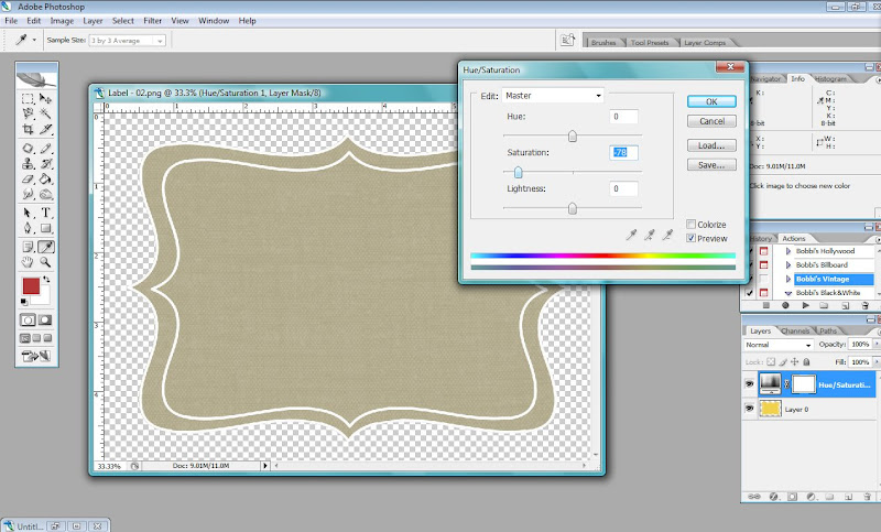
4. Finally, the Lightness adjustment is great for changing an element to be completely white (by dragging the slider all the way to the right) or completely black (by sliding it all the way to the left). I use this alot when working with digital elements, especially when I want to change the object to match any layout. I haven't used this slider on photos much, though. Try and you'll see why :)
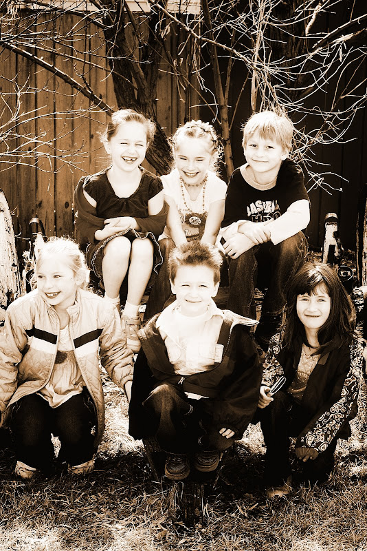
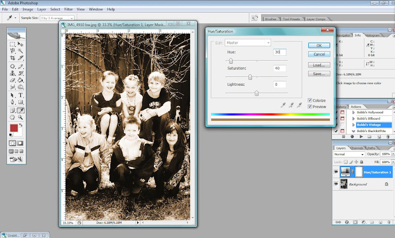
 As an example of how to use this slider on a photo, I'll show you some settings to use to create a simple sepia toned photo. Open a black and white photo (or open a color photo and convert it to black and white. Create a new hue/saturation adjustment layer and check the "Colorize" box. In the Hue box, enter "30" and in the "Saturation" box, enter "40". Leave "Lightness" at "0". You'll have converted your photo to a nice warm sepia tone!
Hopefully you'll be able to use this tutorial to try some neat effect, whether in editing your photos, or in your digital or hybrid scrapbooking! Stay tuned for a fun hybrid project I've created. I'll share when I can!

3 comments:
I've been doing this the stupid way.... Thanks for fixng my mistakes...Yeah you have been missing. I totally noticed.
♥ I've been doing it wrong too! Thanks!
What a great tutorial! I've already learned so much from you! You got an honorable mention at Card of the Week.com for Tutorial Tuesday. Check it out... http://www.cardoftheweek.com/2008/04/tutorial-tues-1.html
Thanks for sharing your great work -- you make it look so easy!
Susanna
Post a Comment