
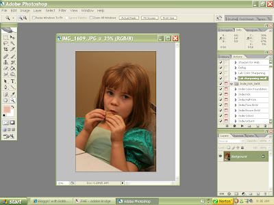
 2. In my example, the first thing I notice is that the entire image is too dark. A quick fix for this is to click "Ctrl+J" and it will create a duplicate of the image in the layer pallette. (Look to the bottom right had side of the screen. The loooong way to do this same step is to go to "Layer>Duplicate Layer>OK" :)
 4. You should immediately see your image brighten up. If the image becomes a little TOO bright, just adjust the opacity slider of your "background copy" layer until you think it's bright enough. When you are done, and like the brightness, you can flatten the image (Layer>Flatten Image)
For my image, I found there was too much red, too much yellow, and too much Magenta in the image. So, In Levels, I first selected"Red" from the drop down menu, then adjusted the gray slider to the right to lower the red levels in the image. Then I did the same thing with the Blue - sliding it to the right. The Green, I slid to the left, to add more because that off sets the magenta in the photo. Frankly, all you do here is select each color channel and move the middle (gray) slider to the right or left until you like the effect. Just play until you like the result! When you happy with the color change, you can flatten the image.
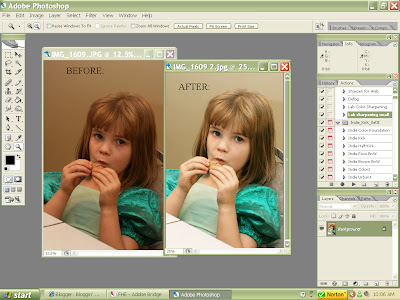
7. Now I've got the color basically where I want it. It will be very difficult to get it "perfect" when you are working with weird lighting, but do your best. Now is the time you can use "Curves" or "Brightness/Contrast" to fine tune the image to your liking. To my image, I added a slight"S" curve and bumped the contrast to 3. No big deal. Oh, and I also reduced the yellow saturation as well (Layer>New Adjustment Layer>Hue/Saturation>Yellow) by sliding the slider to the left. You can see the difference between the before (on the left) and the after (on the right):
Note: If you have full photoshop - you can acheive similar results by using "Color balance" instead of "Levels". You can find it by going to: "Layer>New Adjustment Layer>Color Balance". Just play with the sliders until you like the result.
Elements users (if you have version 5.0 or newer) have a neat little function called "Adjust Color for Skin tone" which works nicely most of the time. Go to "Enhance>Adjust Color>Adjust color for Skin Tone". Do not click "ok" yet. Move your mouse over a spot of skin on your image (you'll see a little eye dropper tool appear on your image) and click. You might have to slide the screen over to side if it is covering your image. Now you can adjust the sliders on the "Adjust color for Skin Tone" screen to your liking. Try it! It worked great for this image:

Now go and try it! There is nothing wrong with playing, remember you have your original safe and sound - you are working on a copy! When you are happy with the results, just flatten and save your image! With some practice (and some courage to play!) you'll notice a big difference in the color enhancement of your photos.
2 comments:
You are awesome! Thanks for sharing!
I just tried this & made my own watermark...check it out & give me your input!
thank you so very much for all your great tutorials, they have really helped me with a project I am doing.
keep up the great work
Post a Comment