Anyway - I know I've mentioned how I love to use digital templates sometimes when I am digital scrapbooking, so I thought it would be a great idea to take you step by step through using a digital template. Crystal from the Digital Template Shoppe was kind enough to design a template just for us - for FREE! - so we can work together through using a digital template step by step! I really want you to try this - I know you'll fall in love with how easy templates can be. If you ever have used scrapbooking sketches to create a paper layout, you'll appreciate digital templates for the same reason - it takes the guess work out of photo placement. That leaves you free to be creative!
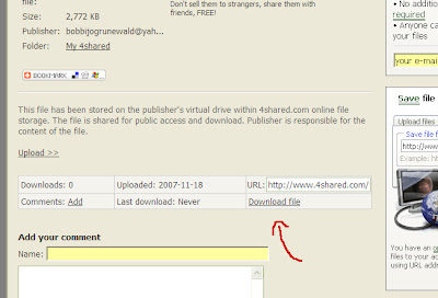
So, first things first! You need to download your digital template. To do that, you will want to click on this link: DOWNLOAD FREEBIE . When you do, you will be brought to a screen that looks like this - just scroll down until you see what the red arrow is pointing to. It takes a minute to load, so just wait and this screen will appear. Click on "Download File"
 Follow the instructions you are given - and when you are asked to save the file, save it in a place you will remember it. You can simply save it in "My Documents" if that's easiest. If you have problems with this step - email me and I'll try to help you out :)
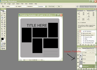
Once you have your template downloaded to your computer, you are ready to use it! Open up your photoshop program, then open your template by going to the upper left hand side of the screen. Click "File>Open" then find your template (by using the drop down menu on the little screen that pops up - if you saved your template in My Documents - look there, and there should be a file called "Template". Click on it, and click "Open". What I do now, is make a duplicate of the template and CLOSE the original. (Image>Duplicate). Now you should have a screen that looks something like this:
 See where the red arrow is pointing? That is your "Layers" pallette. If you don't see this, go to the top of your screen and click "Windows>Layers" and make sure "Layers" has a check mark beside it. If it doesn't, click on "Layers" and that Layers pallette should appear. This is important when using templates - you'll be using your layers pallette a lot! Try to think of this template as a whole stack of papers, cut in different sizes and shapes, that you are going to layer on top of one another to build a page, just like you would in traditional paper scrapbooking. Only with a template, instead of a black square, you'll have a square photo or patterned paper in it's place.
Now you are going to open the photo(s) you want to use on your page (File>Open>click on your photo>Open) When your photo is open next to your template, drag it onto your template by clicking on the photo, holding down the mouse, dragging the mouse over the template, then letting go of the mouse button. You will have a copy of your photo now on the template, as well as the original photo open. Close the original.
 If you look to the bottom right of the screen, you'll notice that your photo is now added to the other layers of the template. (see where the red arrow is pointing) If you can't see your photo, or it is hidden behind the shapes, you will need to click on the picture of the photo in your "layers pallette" and drag it UP until it's above the shape you want it to take.
 I wanted this photo to go in the spot of the horizontal rectangle on the top. So, looking at my layers pallette to the right, I found the black rectangle square and dragged my photo just above it. Now I resized my photo until it was just barely bigger than the black rectangle behind it.
Now here is the fun trick. There is a simple way to make your photo the exact size and shape of the rectangle behind it, and that is "grouping". First - make sure your photo is right above the shape you want it to be (in my case, the black horizontal rectangle) - and when I say above it, I mean in your layers pallette over to the right. Do you get what I mean? Now, make sure you've clicked on your photo layer (which will look like a big square with little gray squares all over it, and your photo on it somewhere) and it is highlighted. What you are going to do (if you are using Photoshop CS2) is click "Ctrl+Alt+G". If you are using Elements, you will click "Ctrl+G". This will "group" your photo with the shape, making it become that shape. What you should see in your layers pallette is this:
Now look on your page - did your photo become the same shape/size as the rectangle? See how easy that was? At this point you can still move your photo around behind the shape - try it. Click on the photo and move it around. You can resize it, whatever, but it is now grouped with that shape. Cool! What do you do now? You repeat the steps with all of the shapes on the template. You can add more photos, or even patterned papers or embellishments. Do you remember where to get digital papers? Look at the tutorial for making a digital page on this blog, and you'll see a link to some free 2peas digital kits. You may need to create a username/password to use them, but it's all free. Okay, so I'm going to go ahead and add another photo, following the same steps as above. I think my layout needs a little color, so I'm going to add some patterned paper, again following the same steps outlined above. I chose to use a digital kit called "Whimsy Style" by Sarah Batdorf from Scrapartist.com. When you download a digital kit - you will need to unzip it using Winzip (when you download it, just click "Open" rather than save, then choose the folder on your computer to save it in).
 When I repeat the same steps, choosing different patterned papers to add on, I get something like this:
Now you want to add your title and journaling. A template gives you a basic suggestion for a layout, and if you want to add your title and journaling where the template suggests, then you look over to your layers pallette, and scroll until you find the white boxes with a "T" in them. Beside each box, there will be writing either saying "Title" or "Journaling block". I'm going to put in my title, so I'm going to double click on the white box beside the word "Title". On your layout, the word "Title" should be highlighted. Simply type in your own title, changing the font, size, or color at the top of your screen.
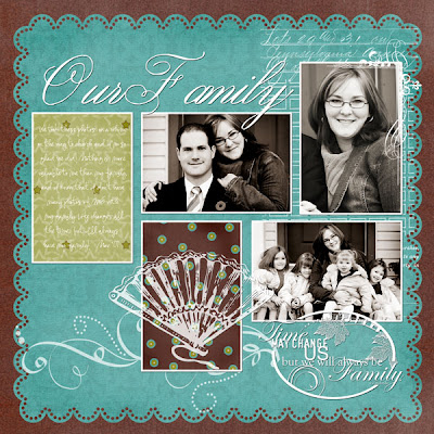
I am going to add some word art in place of the journaling block, so I double clicked on the "journaling block" layer in my layers pallette, and deleted it. Then I dragged and dropped my word art in it's place. So, this is what we've got:


6 comments:
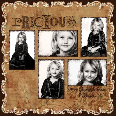
Who is that beautiful little girl in the 'Precious' page? She's a doll! I do read your tutorials but I don't have photoshop on my computer yet. I'm hoping to soon. I will refer back to your blog for help so keep them up. They are very helpful.
I am indeed, I think I've tried them all so far - I struggle every once in a while! it's hard to do it while switching back & forth between CS2 & your blog - but it's awesome!
Love these layouts, they are unbelievable!
I'm going to go to Costco on Thursday or Friday. I've just been so busy with workshops, etc.
this is EXACTLY what I have been waiting for you to teach!
I love your tutorials. As you can see I used yours and one of my fav photos, also from you to make my blog header! You rock!
That is so awesome! Thank you so much, I don't think I would have been able to figure out the grouping thing on my own. SO helpful!!!
Thank you so very much for making this tutorial I have been wanting to learn how to use a template in PSE. The fee download no longer exists so I will have to find one and come back to learn step by step. I can not tell you how excited I am to learn this thank you very much for doing this.
Mary
Post a Comment