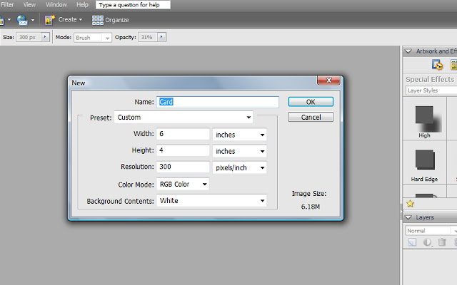
1. First create you new document. For my example, I'm using a simple 4X6 landscape document. In Elements 5.0 I do this by clicking on File>New>Blank File, or by using the simple shortcut "Ctrl+N".
 2. When this box opens up you input the dimensions you want your document to be. In my case, I want it to be 4 inches high and 6 inches wide, at 300 dpi (because I will want to print). You could enter any values here - like 8.5X11, or 12X12 - whatever. I'm sure you've done this before.
 3. Now what we want is to use a grid to divide up the document into equal increments, so we can evenly space things on the document. We do this by placing grid lines on our document. These lines do not print, they are just there as guidelines. First we need to tell the program how many gridlines we want, and where we want them on our document. We access this by clicking on Edit>Preferences>Grid.
4. A little box like this will pop up. Here you can input the color you want your lines to be (I chose black), I chose to show a grid line every 1 inch, and four subdivisions within every 1 inch block. You can play with these numbers and change them up until you get what you like. Click OK.
5. Your grid lines may appear now, but if they don't, you'll need to click on View>Grid, to tell the program you want to see the lines.
6. Now you'll see lines like this appear on your document. Each of the darker lines are the 1 inch divisions, and the dotted lines are the subdivisions within each 1 inch block, Does that make sense? Isn't it cool how it breaks up your document into evenly spaced sections? You can see where I'm going with this, right?
7. Now you can build your page, card, or whatever by opening photos, adding text - whatever you are planning to do. Only now you can place them evenly throughout your document. You could add three photos in a row, with 1 or 2 squares in between them to evenly space them, if you were making, say, a storyboard. You can get your text exactly centered. Etc. Etc. Etc.
8. For mine, I added my photo, added some text, and then added an outline about a 1/4 of an inch inside the edges of the document. This is a super simple set up, but I'm in a hurry today :) If you want to see what it looks like without the grid lines showing, just click on View>Grid and it will make the lines disappear. If you want to see the lines again, just click on View>Grid again.
9. Voila! Perfect alignment every time! I hope that helps!


2 comments:
Thanks for doing the tutorials! I know a lot about Photoshop but just do not have time to read up and play on all the little nuances.
Thanks again!
THANKS! I was hoping for a tutorial on this topic this week. I use the grid thing too, but I had forgotten how to customize it. For some reason my cs4 lost a lot of my settings when we moved this past summer. Thanks again!
Post a Comment