1. First you need to create some buttons in your photo editing program. (I did mine in photoshop). You first need to know how wide your banner is. One way to do that is to open your blog, right click over the banner, save the file, then open that file in photoshop. Once your banner photo is open in photoshop you can go to Image>Image Size (Alt+Ctrl+I) and look at the width of your banner. Then, divide that number by how many buttons you are making.
For example, my banner is 1170 pixels wide.
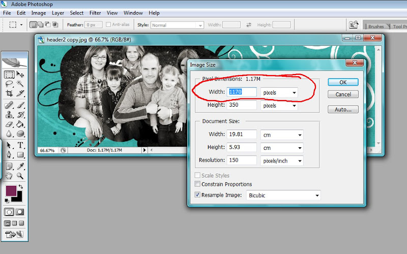
So, since I wanted to have 5 buttons, I would divide 1170 by 5 and make each button 234 Pixels wide. You can decide how tall to make your buttons. So, create a new file (File>New) and enter the custom settings of how big you want to make your buttons. In my case, I am making my buttons a width of 234 pixels, a height of 50 pixels, and a resolution of only 150 pixels/inch (this is just for the web, after all). Click OK.
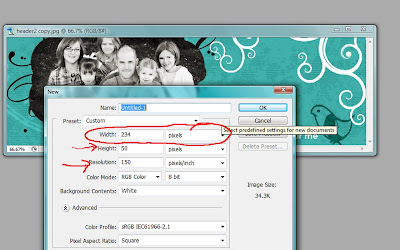
Design your button however you choose. Be as creative as you want. When you are done, save your button as a jpeg file and repeat the process for each button.
2. Upload your button images to a site like photobucket (or your favorite image hosting site). Okay? Okay.
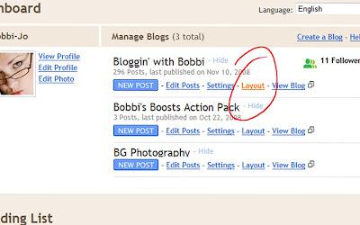
3. Now is the tricky part. Just follow along closely and you'll be fine. Open your dashboard to your blog. Click where it says LAYOUT.
 Then click where it says "Edit HTML" and you'll see a page like this (you've probably seen this page before). Now, at this point, I need to remind you to save a copy of your template, just to be safe. You don't want to mess with the HTML code without saving your original template first. Okay, now that the disclaimer is over....
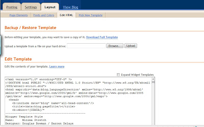
Look for the part of the code that looks like this (it will be about 3/4 of the way down the page):
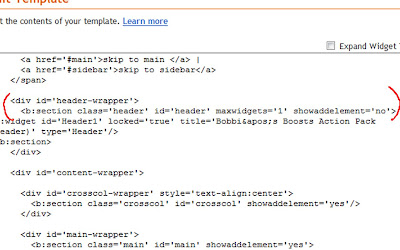
It's the bit of code beneath the header-wrapper bit.
What you are going to do here is change the number beside "maxwidgets" from 1 to 2. Now, change the 'no' beside "showaddelement" to 'yes'. Did that make sense?
Scroll down a little further and find the place in the code that looks like this:
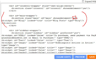 It's the bit after 'main-wrapper'. Change the showaddelements to 'yes'. Almost done!
But, you're not quite done yet. One last piece of code to change. Find the spot where you see the code reading:
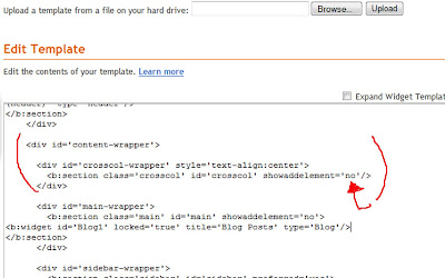
It's the bit after 'content-wrapper'. Change showaddelement to yes . That's it.
NOW you're done with this page. You should now have an 'Add Page Element' option between the Blog Title (header) and the blog post section. Click "Save Template" and then click on "Page Elements" on the top of your screen. This will take you to where you can see your blog layout, and add some elements. You should see a bar under your header where you can add a gadget now!
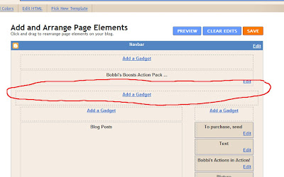 4. Click on Add a Gadget, and when the menu pops up, click on the one that says HTML/Javascript.
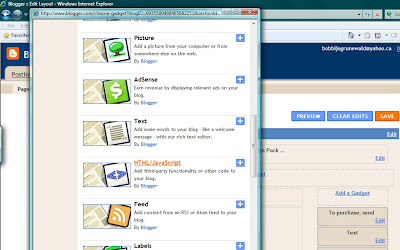
5. When the little screen pops up, do not add a title. In the content box, you will now copy and paste your HTML tag for your buttons you created back in step one. Keep your Blogger page open, and in a separate window, open Photobucket (or whatever site you uploaded your button pictures to). Copy the HTML code for each button and paste it into the content box you opened in blogger. The code in photobucket will look something like this:
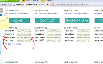
5. Copy and paste each HTML code in order on the little HTML/Javascript screen you opened in Blogger. Now, you will need to write down the website address of each place the buttons are supposed to take you to. For example, your HOME button, when you click on it, should take you to your blog address. In my case, blogginwithbobbi.blogspot.com. My 'CONTACT' button obviously doesn't take me to a website, so instead of having a website address, I'll write down (on a peice of paper) mailto:youremailaddress@whatever.com. Do this for every button - write down the place it's supposed to take you because in this next step we will be inputing it into the code you just copied onto the box.
6. Okay, now you are looking at your box with all of this HTML coding in it. Looks kinda confusing right? I know, just breathe and we'll get through this :) What we need to do, is tell the computer to send you to a specific location when you click on the button. We'll do that right now. So, this is what you are looking at:
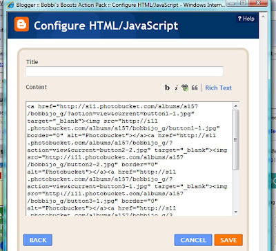 In the section of each HTML code you copied there will be a piece of code that looks like a website address to photobucket (or whatever image hosting site you used). This bit of code is going to take you to Photobucket when you click on that button. We are going to tell it to send you to the spot you WANT it to send you by changing the website address . Everything between the " and " (until where it ends in .jpg) you will highlight, and delete. Then enter your own addresses, instead, for each button. So, the code that used to look like this:
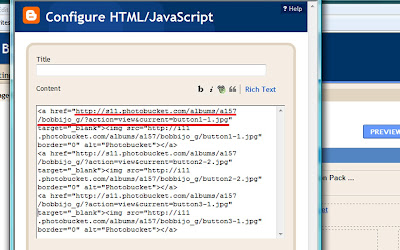
will now look like this:
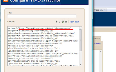
Now, change the url to the url you want the button to point to, corresponding to the button. Enter in the website addresses you wrote down on the piece of paper. So, for your home button, enter in your blog address, for your CONTACT button,don't enter a website address in that space, instead enter "mailto:youremail@email.com". And so on for each button. When you have completed changing each code, you only have one last change to make (I Promise!)
7. The last thing we are going to do is center the buttons by entering <> (with no spaces) at the beginning of the code (the top of the box) and < /center > (with no spaces) at the very end. That will center all of the codes in between. Click SAVE and then check out your blog! Enjoy your menu!

13 comments:
Oooooo, ahhhhhhh! Wow... that's GREAT! Thanks for such great instructions! Now, am I brave enough to try it?
I'm so in love with this!! I may have to try it! I'm not scared of HTML!! ;):) Thanks for the VERY INFORMATIVE TUT!!
I'm so going to try this!!! Thank you SO much!!!
WOW! Thank you!
I have a question, have you seen on any photographers blogs how they put digi scrap paper on the wall as the backdrop? I don't know if that makes sense or not...somehow they cover the wall in P.S. with the paper. I want to know how to do it if you know!
You are soooo stinkin' talented! I'm glad I have my hubby to do these things for me!!!
Thanks for sharing Bobbi!
i WAS WONDERING HOW YOU DID THAT YOU LITTLE SMARTY PANTS!!!
I just hooked this up over at girly do's--- thank you!
Thank you for taking the time to show us how to do this! You ROCK!!!
Okay. Bobbi, it's official at our house. You are Just SO smart!!! : D
This is fab! I would definitely try this one, thanks for sharing!
Thank you, thank you, thank you. I've been trying to figure out how to do it. I think it looks so professional on one's blog. And now mine can be like that too.
You're so sweet for sharing (taking the time to do that too).
THANKS! I'm def. going to do this...been wondering how for months...and just gave up. I just happened across someone else's blog that had a menu and I was like, "HOW'D you DO that?" They directed me here! :) Wonderful information!
I paid to have my blog redone and she did make my menu bar with drop down menu, however, when it messed up and reverted back to the way it was before she added the html code - with just the pages listed, I haven't been able to fix it and she doesn't mess with it after making it. Maybe now I can fix it. I hope.
Thanks.
Post a Comment